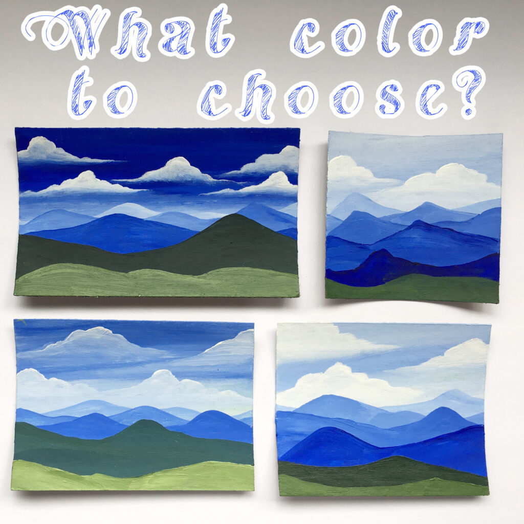
One of the biggest challenges I face in my daily painting is color choice and tone because frankly I just wing it and like painting with monochrome pallets when I’m lazy. When I took my painting class during the spring, I learned the basics of the color wheel, how to shade, and how to blend different colors, even skin tones briefly. I have always” liked” painting but I never considered myself an artist in any form of the word.
I wasn’t the girl in high school who was obsessed with painting or drawing, frankly, I only started painting a lot when I was maybe eighteen. For the first few years of high school, I was really involved with musical theater and choir, but I suppose I would draw little sketches on scraps of paper at my first job. Of course, now I remember the countless doodles all over my notes because I liked to make holes in the paper little people’s heads, and boy don’t wish I kept those pages. the last year or more was online high school (not exactly typical).
To get through that topic as quickly as possible, I only started painting and sketching on canvas or anything other than scraps of lined paper after I moved out of my childhood home. All in all, it has only been about two years of painting somewhat consistently (but I must admit it has been mostly inconsistent up until recently). I think I felt really overwhelmed by other artists on social media because everyone seems to have such beautiful color schemes established.
I felt like a floundering artist who continued to pull out absurd and “slightly off” colors. I spend hours upon hours looking at the colors in the isles of my favorite craft stores, comparing shades, and buying a few to compare opacity and texture. It first started with the cheap crafting paint found at grocery stores but since taking a painting class I have realized the importance of quality products. There is a major difference in the color you get out of paints found in a set or paints you buy individually, and the colors you can create vary greatly.
I could go on and on about paint and texture, opacity, vibrance, etc. but what continues to baffle me is mixing colors I like to paint with. I can mix a brilliant orange-red color for a sunset but then when I am mixing a forest green to compliment that brilliance, I end up feeling like an amateur. The more I learn about color theory and observe artists I admire; I notice that shading and tone are where this color choice really comes into play.
I could mix reds and greens and yellows or blues all day but there will be no depth if there are no light spots enhanced with white paint or shadows pulled down with black or blue paint. I have noticed that adding white to whatever color I have mixed does give it a new tone that I am drawn to. Something I often forget to take advantage of is shadows and creating depth by deepening colors with black.
For someone who never considered herself an artist, all of this color theory made me question how good of an artist I really am. If I can’t even create a beautiful color pallet off the top of my head, then why should I call myself an artist? If I can’t identify a complimentary color pattern easily then who even am I as an artist?
It is easy to fall into the pit of despair and self-doubt, but I had to remind myself that no one starts out with all of this information. Frankly, it’s just theories, not something I should feel any less for not having memorized. I have to remind myself of all of the self-taught artists I admire on social media. Do I really think they knew all about color palettes and theory when they first began creating art? No.
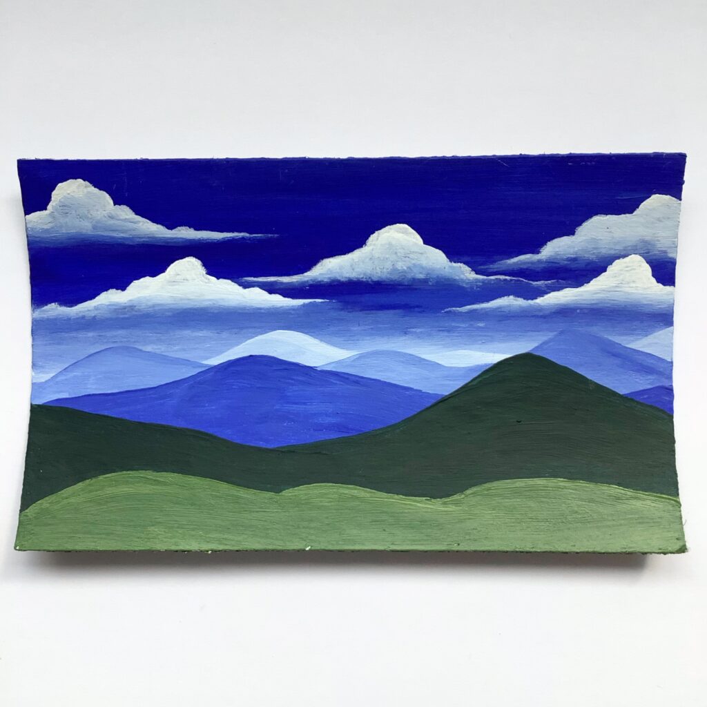
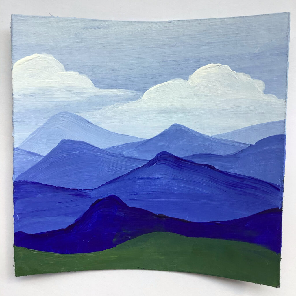
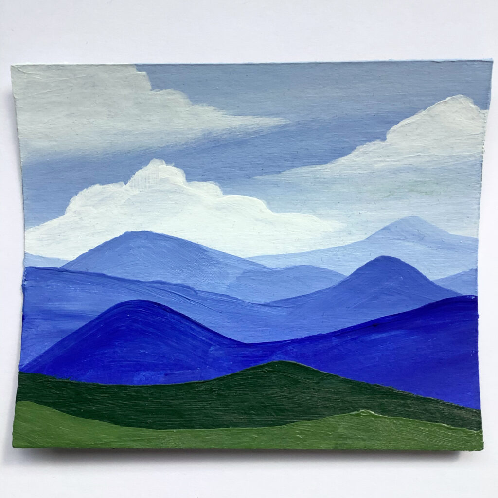
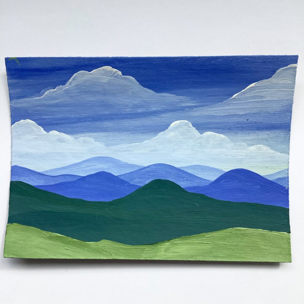
So, with a more forgiving and understanding heart, I want to explore color pallets I like, understand color theory in my own paintings, and begin establishing a sense of what colors to use before I begin painting. As of now, I just tend to put one color on my pallet at a time, focusing on the blue in the sky first or the green in the mountain tops. I am notorious for repainting over colors that I decide halfway through a painting just aren’t good enough, and you can see that in my video this week.
Click the video below to see how I struggled with color choice on a limited-sized canvas and how I adapted to using different materials this week! I kept it simple with some easy landscape images but I tried to mix and match colors, play around with tone and shading, and hone my technique.
PO BOX 12, Elk City, OK 73648

Updates on New Paintings, Content, and Product Releases!
Member Exclusive Special Sale Events throughout the Year!
15% Discount on your first order after signing up!